GoPro Redesign
Improving the GoPro app to simplify syncing and sharing to spend more time on making adventures.

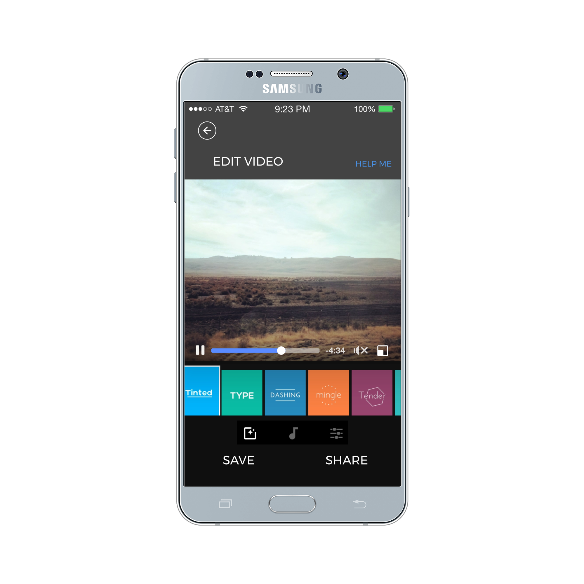
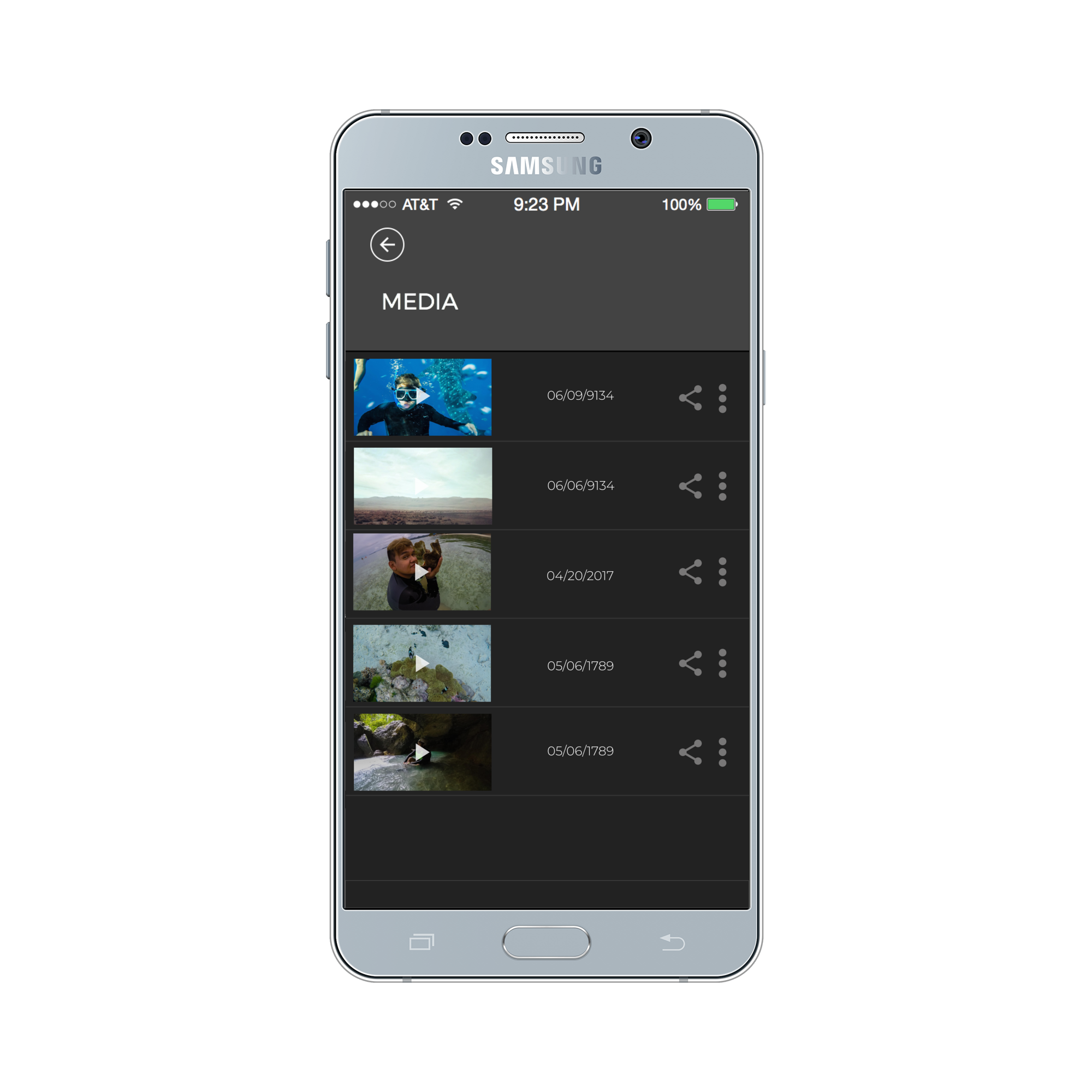
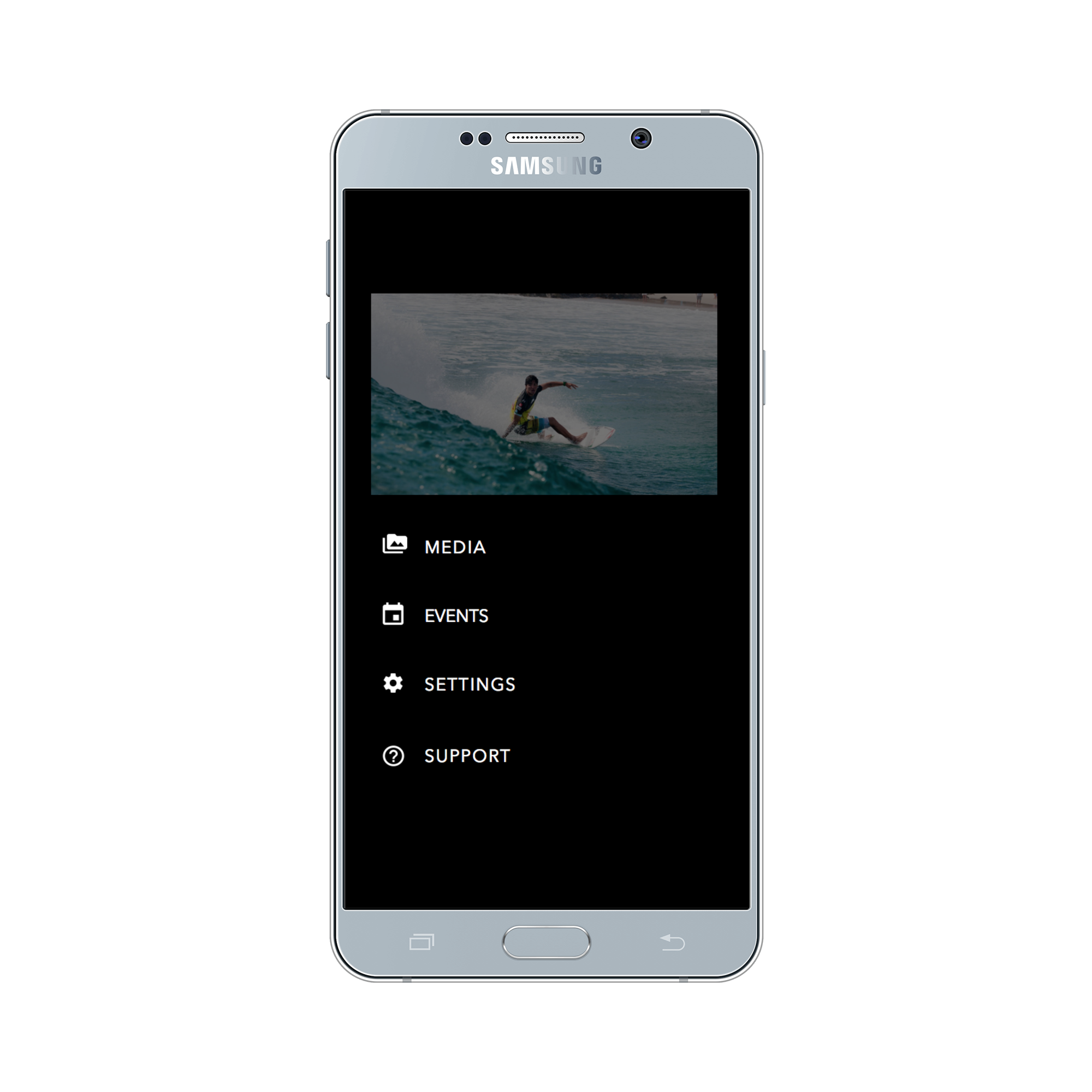
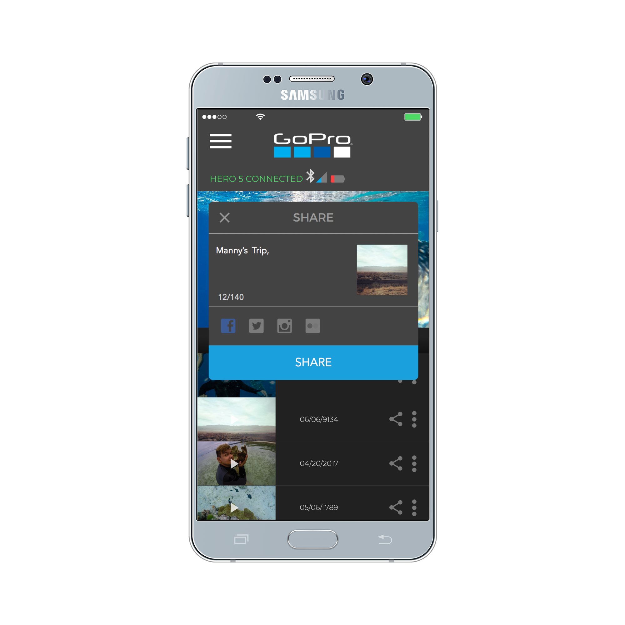
Final UI Concept
OVERVIEW
CLIENT:
Student Project for Mobile Design Course
PROCESS:
Target User Interviews , Empathy Maps , Storyboard, User Flows, Low-Fidelity Prototype, User Testing, High Fidelity PrototypeROLE:
Researcher and Designer
Insights
For this project, I decided to redesign the GoPro app in which I happen to use almost daily during my commutes to school on my motorcycle. However, I find myself very frustrated having to use the app with the camera, and quite often I opt out to use it at all. It is a costly piece of equipment, and it is a shame that it only has 3.9 stars out of 5 in the Google Play Store. Much of it I believe comes from not fulfilling many of the expectations which as designers we call user requirements. I hope that someday in the future I have an opportunity to work with a company who wants to help its users create memorable experiences with the technology they use and have to worry less about making it work. This was a fun project for me, and I learned a lot about what makes products innovative and successful through design research.
User Interviews
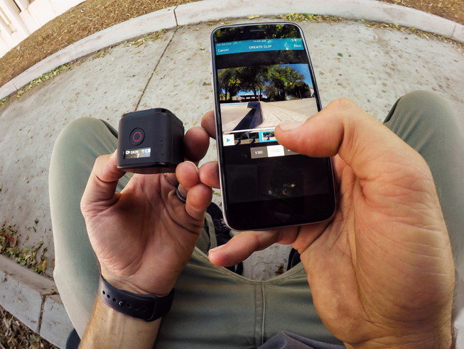
I began this project by conducting user interviews with people who use GoPro cameras to capture their adventures. The goal was to gather insights into what users think about its use, application or hardware. Also, I learned about their process and how they accessed videos from the camera in unconventional ways. They pointed out things that were important to them such as sharing videos and preserving battery life. Their stories provided me with qualitative data that helped me inform future ideas.
Empathy Maps
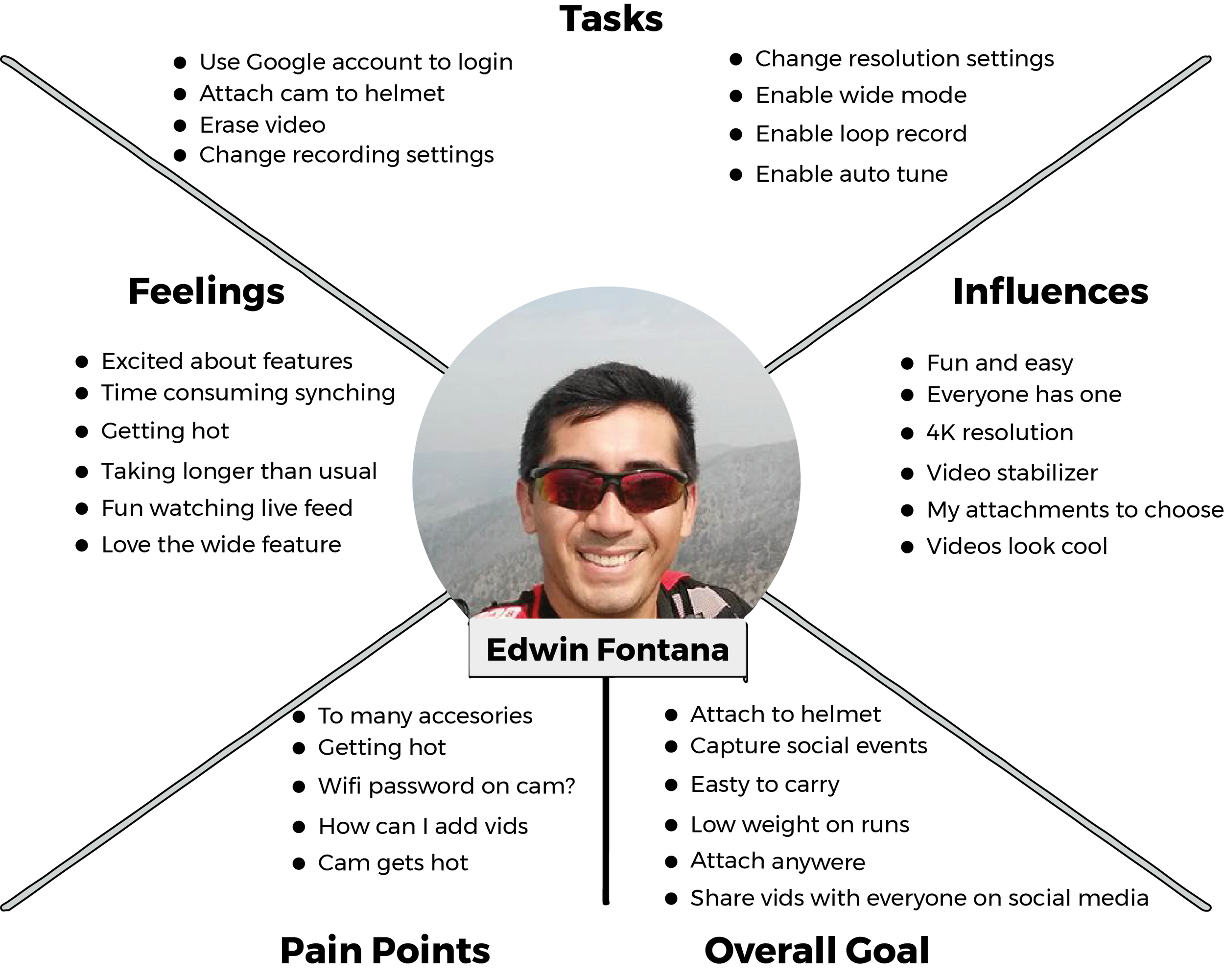
From our interviews, I began to visualize my participants' attitudes and behaviors through empathy maps. It helped me understand their environment and feelings in using the product. Instead of creating personas I used them to tell their stories. What articulated to me was that all my participants had very little good to say about their experience using the product to share their videos with friends and family. The users were always worried about battery life and often times carried an extra portable battery to avoid missing moments. Other pain points included synching the camera with the app for the first time, which often times was avoided due to its complexity.
Story-boarding
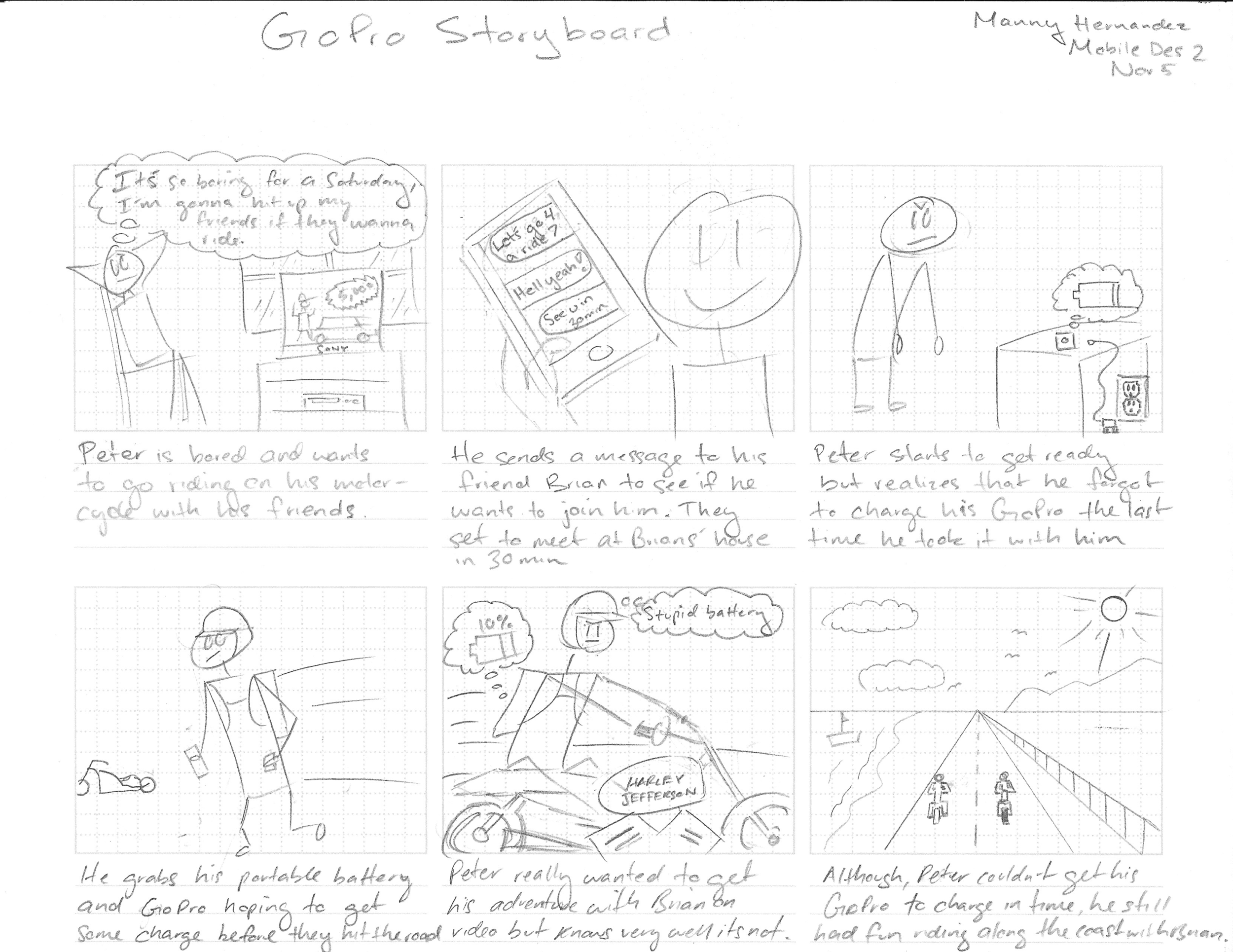
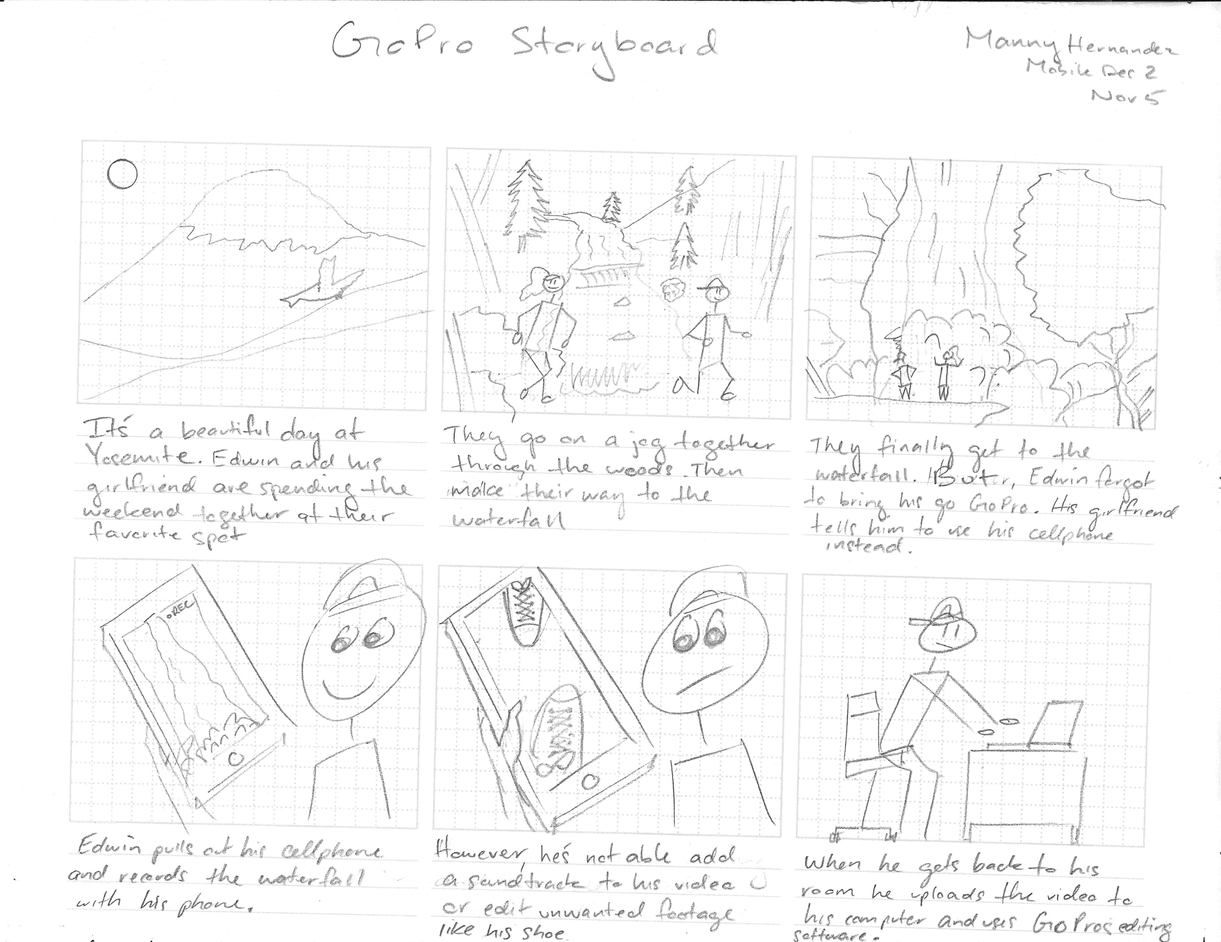
I created two storyboards based on my user’s stories to provide additional context to myself and possible stakeholders. These are very simple visuals, but the scenario is very memorable for highlighting situations in which my participants had a bad experience in using the product. The first storyboard is a scenario in which Sadid decides to go on a motorcycle ride with his friend Peter but soon realizes that his GoPro is dead on battery. He often has to take a backpack to carry a portable battery so that he can get some recordings on tape. The second storyboard is based on Edwin’s trip to Yosemite with his girlfriend in which he forgets to bring his GoPro but uses his cellphone to record the moment. However, he finds having to upload the video from his phone to the GoPro editing software complicated and confusing to use.
User Flow - 01 Add a Cam
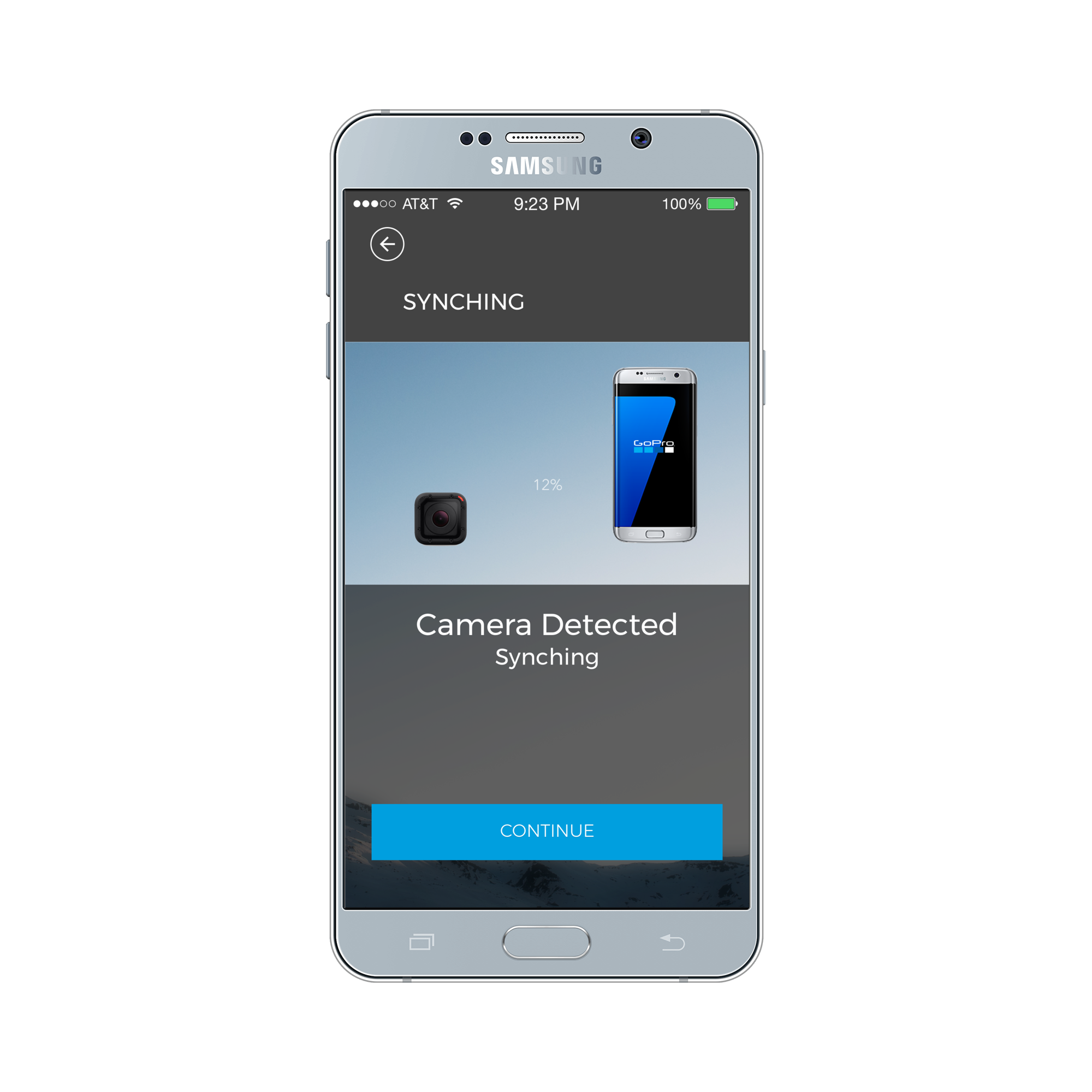
This user flow visualizes distinct steps of what a user does to synchronize a GoPro camera with the GoPro app initially. All the users expressed frustration during this process and was a chief reason for avoiding the app.
Flow Implications:
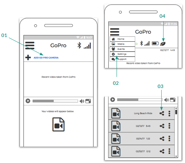
On the main screen, I’ve added a “Add a GoPro camera” button to avoid confusion. I added images that will use micro-interaction to help users receive feedback during the synchronization process.
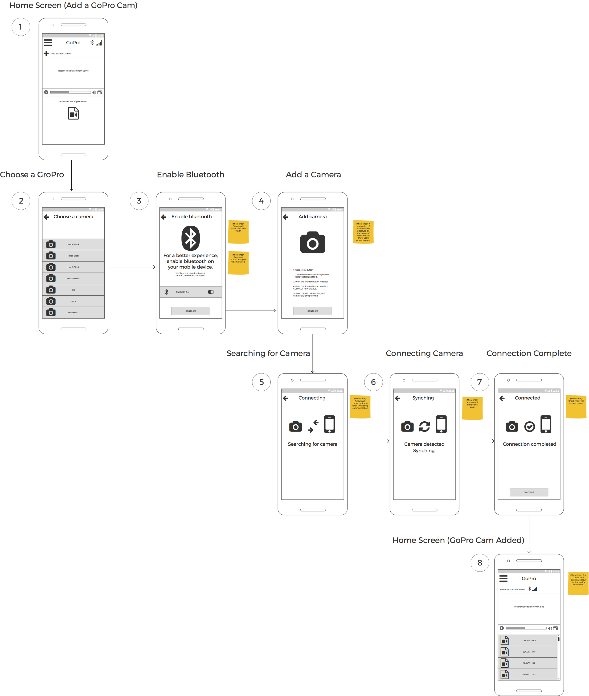
User flow for synching GoPro Camera with app.
User Flow - 02 Save Battery
Another chief complaint was that the GoPro camera battery life diminished quickly after connecting to the mobile app due to its Bluetooth capabilities. The main issue for its massive battery consumption is because users forget to turn off the Bluetooth function on the camera after transferring their videos. This site flow enables users to enable power saving mode which will automatically shut off the connection after no activity is detected for some time.
Flow Implications:
Users are able to toggle the power saving mode through the settings menu that will automatically shut off the connection after a few minutes of inactivity. User will see a power saving icon on the main screen that will enable longer recording sessions.
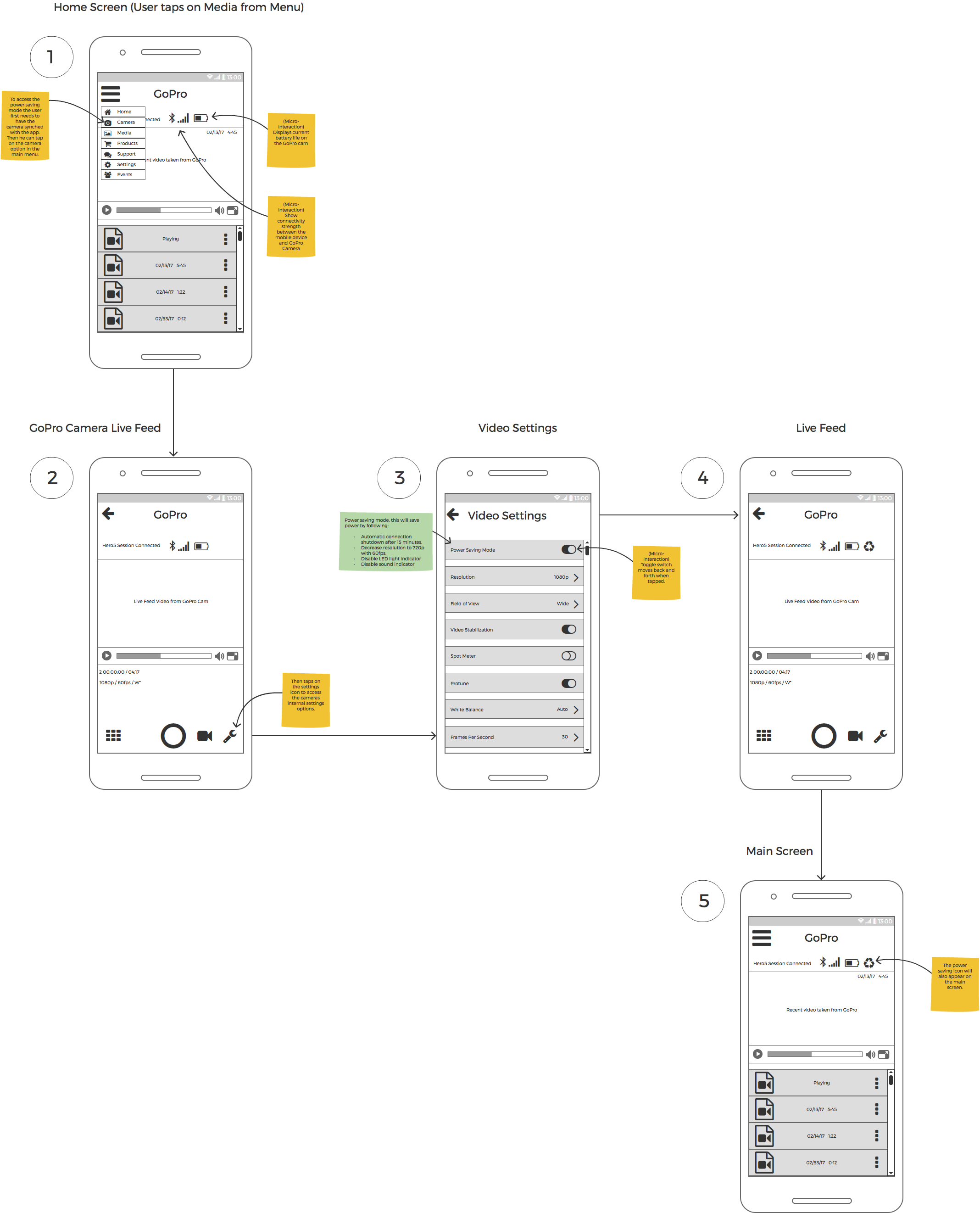
User flow for enabling power-saving mode.
User Flow - 03 Edit and Share
One chief complaint was that the GoPro camera battery life diminished quickly after connecting to the mobile app. This issue is caused by not turning off the connectivity connection on the camera after syncing with a mobile device.
Flow Implications:
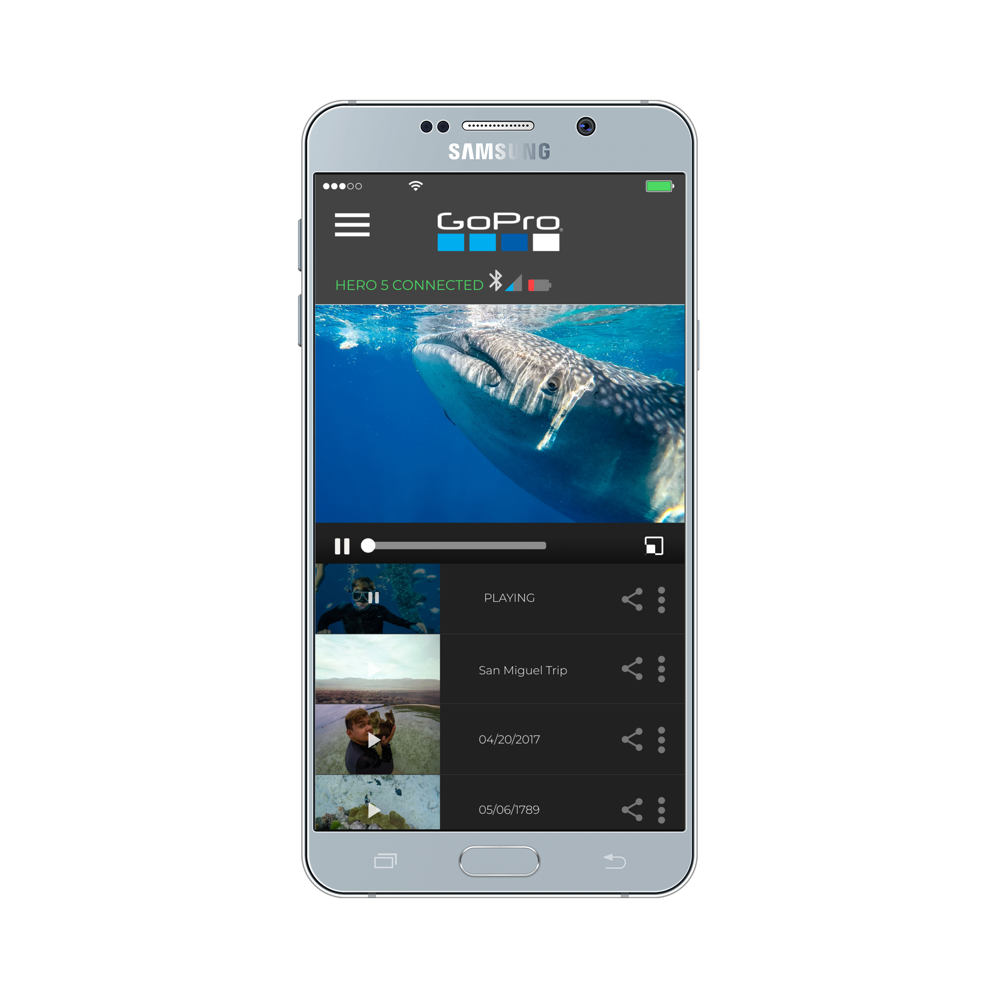
I used some inspiration from apps like Instagram and video players like VLC Player to help me create a flowchart that many might be familiar with. I reduce the number of steps by adding the ability to share videos from the home screen.
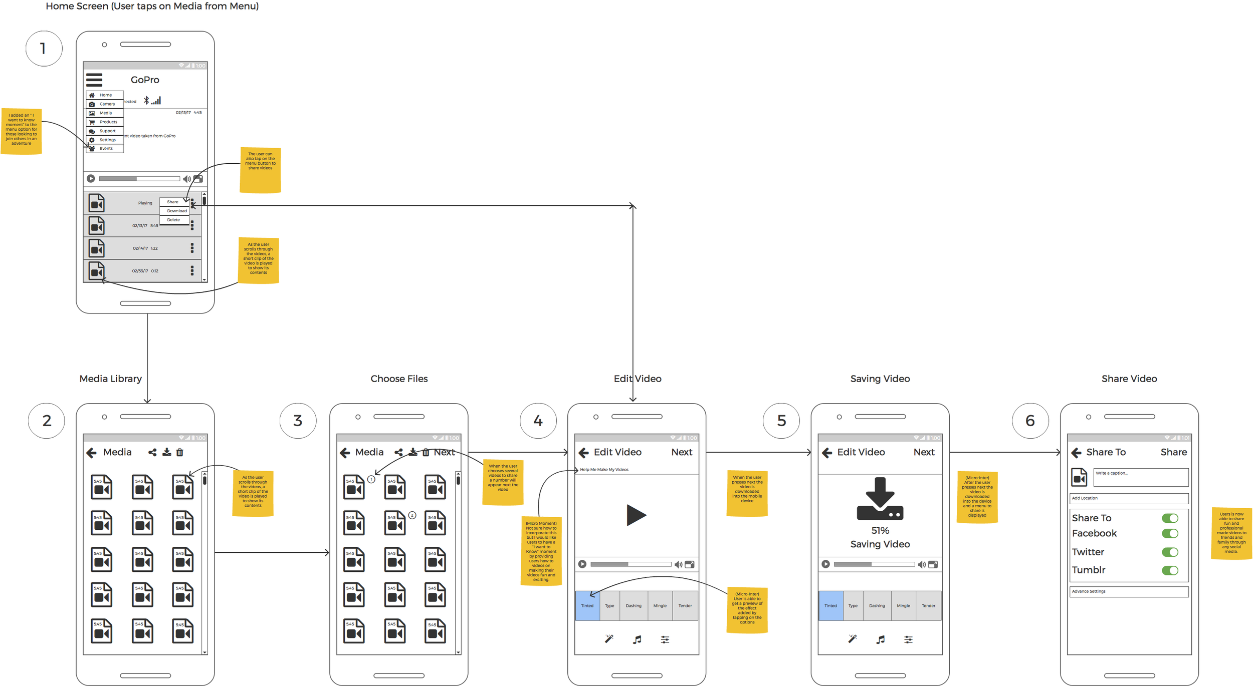
User flow for editing and sharing videos.
User Testing
For my user testing I used the same three participants that I interviewed. During the user testing I paid extra attention to what they did compared to what they said. I observed their behaviors to find out what worked and didn’t work in my prototype. Their body language and, facial expressions told me more about what they were feeling as they got stuck in some areas of my prototype. During this exercise I gathered qualitative and quantitative data and discovered usability issues in my product. There was very much room for improvement to areas that I did not see whatsoever after spending several hours working on it.
User Testing Video - Participant 1
This is one of three user testing videos. Sadid is a very close friend of mine and he often times he volunteers to help me with my projects. My inexperience is apparent during this user testing, but I follow the script as much as possible to practice being comfortable. I document all usability testing with videos and screen capture software to not only see what the user is doing but also understand body language.
User Testing Summary
My user testing brought forward issues. For the first task, two out of three users were able to add the GoPro camera without problems. However, for the second task which was to enable power saving mode all three of my users would tap the menu button then on settings to complete the task. This mental model was noted to redesign the process of enabling power saving mode.
For the third task which was to edit the video and share on Facebook, users had issues with editing the video and sharing on Facebook. It appears that the problem is how I worded the task. Users were looking for the Edit button instead of the Share button which lead to the editing options. Although this was a problem, users manage to complete the task. However, revisions will be made to fit the mental model of the users better.
Problems to Solve
It takes user’s approximately 10-15 min to synchronize a GoPro camera with a phone device successfully.
Once connected the user must remember to shut off the connection to the camera. Otherwise, the camera gets hot and wastes more power.
Users need to install an additional app named Quick to add titles and music to videos taken on the GoPro cameras.
Revisions Made
Made the typeface for “Add a GoPro cam” more visible for users to discover.
Allowed users to access power saving mode through settings.
Added a share button on the main screen for quick sharing and editing.
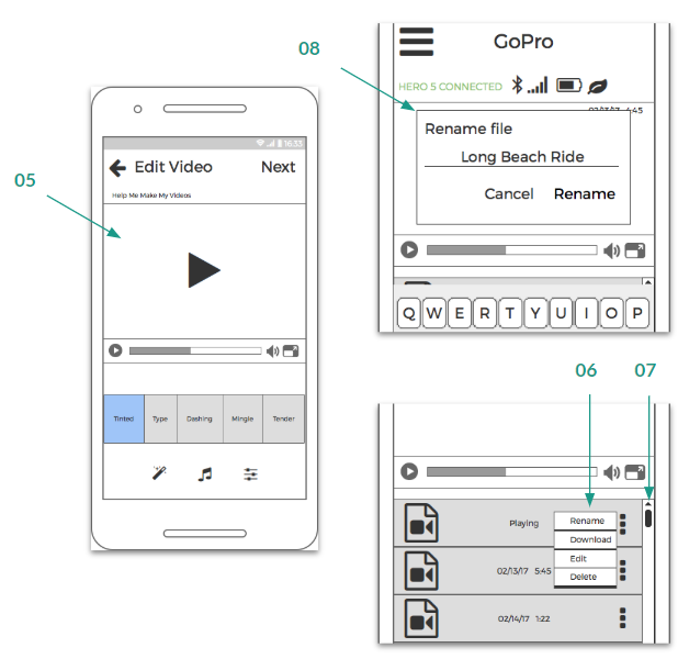
Replaced recycle icon with a leaf for power saving mode.
Created more screens to explore more areas of the prototype.
Added a menu to the videos for quick access menu items.
Added a scrollbar to the prototype for user testing on smaller screens.
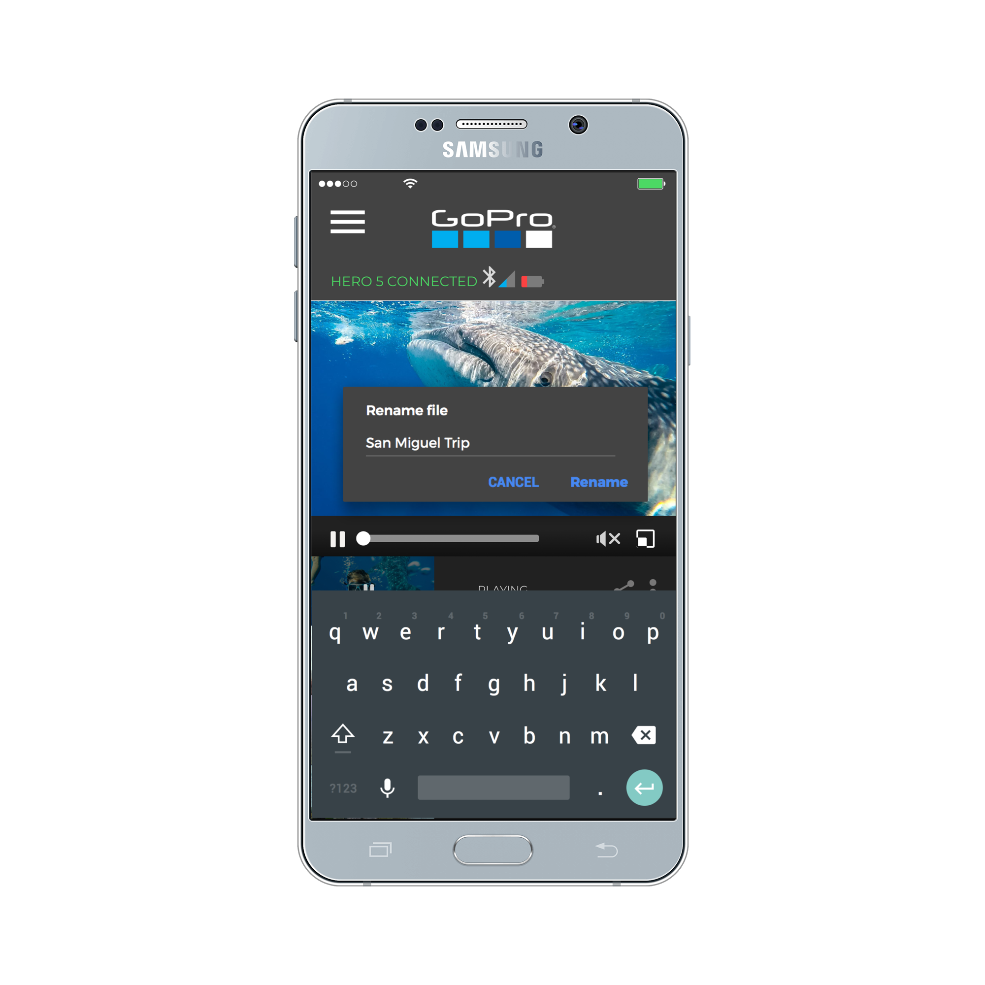
Allowed users to rename videos to find them easier in the future.
2nd Iteration Prototype and Testing
For this second round of prototyping and testing, users found the application more familiar and relate-able to other similar social media apps. Familiarity was vital in creating a user-friendly interface that can match existing mental models of the user. With the feedback received from users and peers, this user testing round proved to be more promising. The lack of high fidelity made some areas of the user testing somewhat conceptual for the user. However, a high fidelity prototype was in the works, and with micro-interactions, it could help the user understand what is going on in the background leaving little behind to wonder. Please try the prototype yourself and give it a try.
UI Designs
Although the UI is different from the GoPro app, I wanted to keep its branding intact by using their typeface and color palette. Users should feel like this is an enhancement to the existing app. I gathered inspiration from native camera apps that use simple menus and options to create a fun and friendly interface. The goal here was to empower my users into feeling in control of what they can do from the main screen. The end product felt cohesive and enhanced according to some users.
High Fidelity Prototype
This is my opportunity to show you my app in actions. This simulation allows the user to complete five tasks.
Add a GoPro Camera
Enable Power Saving Mode
Share videos
Edit Videos for sharing
Re-name videos
Because this is a prototype, I am sure that this project can be further refined and polished through several user testings and iterations.
This project was a real challenge for me having to do all the work. It has made me appreciate the value of working with others to achieve something like this in a short period. I am proud of this project and had a lot of fun working on this. I hope that in the future I can be part of a team that can create memorable experiences for everyone.
Promo Video
Check out this nifty promo video I made demonstrating my prototype. Thanks for visiting!


